April 4 - Color Report Card
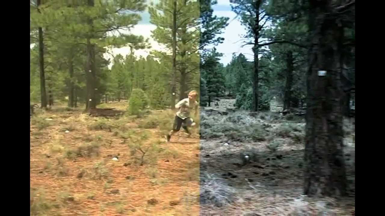
I've been working on color grading and HDR. What's that? Color grading is when you apply a filter to an image to change the colors, typically to bring out certain colors and make a scene more vibrant. It can also be used to desaturate an image or create a specific look. Films use it a lot to convey a genre, like how all horror movies have a certain look. Like this:

The old look of the game tended to be very vibrant, but also washed out a lot of the colors. Here's a common scene you may find yourself in, standing on top of a random roof:
Bright and happy, but you lose a lot of detail. It also tended to make the geometry and structures cartoony. While that was the original intent, feedback and testing has revealed that to be unpopular. Also, I want to bring back some of that detail lost. Here's the new color grading:
Brings out more of the blacks, more realistic lighting, and greater detail on structures especially at a distance. Here's also the scene with no post-processing at all:
It was also important to tune the lighting, as some surfaces would get washed out and lose all detail when there was strong lighting on them. HDR is used to increase the range of lighting that can be represented in a picture, increasing the detail of lighting across a surface. Then, since most displays can't handle that range, it's tonemapped to compress the new colors into a visible range. This brings out the detail in heavily lit surfaces.
The lighting on the shack to the left looks much more realistic. Warm, but not bleached.
I've also been working on art and removing placeholders. You can see a new building in the background of that above picture, and I'll be working on replacing all the buildings in town with stuff more like that and less like the building to its left.
Get Rogue Legend 2
Rogue Legend 2
Run a farm, a shop, or dungeons with friends
| Status | In development |
| Author | Kassoon |
| Genre | Adventure |
| Tags | Action-Adventure, Action RPG, Casual, Co-op, Crafting, Exploration, Farming, Fishing, Open World, Relaxing |
| Languages | English |
| Accessibility | Color-blind friendly, Subtitles, Configurable controls, High-contrast, Interactive tutorial, One button |
More posts
- Placing Markers - Dec 6Dec 06, 2019
- Farther and Deeper - Oct 11Oct 11, 2019
- Getting Salty - Sep 27Sep 27, 2019
- Measuring heat - Sep 11Sep 11, 2019
- Early QoL - Aug 30Aug 30, 2019
- Immersed in obsidian - Aug 7Aug 07, 2019
- The UndersideJul 19, 2019
- Research and XPJul 09, 2019
- Maps - May 29May 29, 2019
- Almost There - Mar 20Mar 20, 2019


Leave a comment
Log in with itch.io to leave a comment.